I Overcomplicated Datadog Metric Types Until They Finally Made Sense

Hello, my name is Nick and I have a weird brain. I think it’s a pretty cool one, but it definitely doesn’t work as the manual suggests. After explaining overly complex things to people before, I’ve had them look at me and say, “man, I would love to see what it’s like in there for a day.” Hell no you don’t want that, it’s loud in here because the world's worst jukebox is playing at full blast and has a tendency to take some of the worst earworms of songs and play fragments of them on repeat, and every other thought is an intrusive one.
But I digress. Besides the tip of the iceberg of inherent weirdness just described, the thing that gets me most often is my ability to understand overly complicated topics with ease, and struggle with the simple ones. If you ask me for a meeting and then say you’re in Central Time, I basically blue screen trying to figure it out. Want to talk about the various depths of mathematical infinity and string theory? Buckle up for a few hours, bucko - I got you.
When I struggle to understand simple concepts, I find that I can understand them if I overcomplicate them - I’ll go down a rabbit hole to truly understand a simple concept in depth. Let’s do that now.
On Paper, These Are Simple
Datadog metric types come in a few flavors: gauge, count, rate, histogram, distribution, monotonic counter. On paper, they’re pretty simple (which is the damn problem!):
-
Count: the number of times something happens in a given period of time
-
Rate: effectively the sum of the count divided by the window of time to show items per second
-
Gauge: a single measurement at a point in time
-
Histogram: a statistical representation of an array of values in various percentiles, calculated agent side
-
Distribution: sends the raw data of all values for the time period, calculated server side
This is too damn easy…I need to know how this actually works.
Now With Actual Numbers
We need numbers. We’ll use this array for all of these examples: [1,1,1,2,2,2,3,3]
Count
Those combined make this metric submission a value of 15.
Rate
If we assume the collection interval is 10 seconds, we divide the count of 15 by 10 for a value of 1.5/s.
Gauge
Emits the last point in the series, for a value of 3.
Histogram
Emits average, count, median, p95 and max by default, for corresponding values of 1.8 (count of 15 divided by 8 elements), 0.8*, 2 (2 being the middle number), 3, and 3.
*...what the hell? I said count. We know the count as a regular count metric is 15, why is this 0.8? It’s because the .count metric is actually sent as a rate. Kinda odd, but inconsequential because you can change the display to show count or rate with this metric.
Distribution
Effectively the same as histogram, except…if more than one source reports this metric in a given flush interval, with some of the same values, the metric represents the global statistical distribution of all values collected from both sources. So if source A submits [1,1,1,2,2,2,3,3] and source B submits [1,1,2], leaving us with average, count, max, min, sum, p50, p75, p90, p95, and p99, with corresponding values of 1.73, 11*, 3, 1, 19, 2, 2, 3, 3, 3.
* Wait wait wait - the histogram count was 0.8 for basically the same values, now the count is 11?! What the fu… WELL distribution counts are actually counts. That said, count metrics can also show as rates.
Lost yet? If you’re not, hold your breath. If you are, wait, there’s more. Something that would be important to note from above would be the whole “collection interval” part of things. The agent has a collection interval. DogStatsD has a collection interval (because it goes through the agent). The API…well, to quote the Datadog docs: “Datadog does not rate limit on data point/metric submission.”
Who Can Send What
So where do we go from here? Obviously we write code to show all of it in action. First of all, we need to know which sources can send which data types to begin with
* Sent through a different metric submission endpoint; noted as different because (besides the obviously different endpoint), the method used in the SDKs is different as well
So I Wrote an Agent Check
Here’s a super simple agent check that shows us all of the submittable data types:
What this is setting out to prove is pretty straightforward. In the __init__ function, we set the odometer and runs counters for the purposes of mucking up our monotonic counter. Anything in that init block persists through agent check runs, so that’s where the modulo part comes in later. Every 20 runs, we drop to 0.
Based on this check, here's what we would expect to see:
-
The gauge metric always reads as 99
-
The count point will always be 6
-
The monotonic count increases by 150 until we hit 20 runs, then it goes back to 0
-
The rate should be 10/s, since it’s incremented by 150 every 15-second flush interval
-
The histogram should literally show 50, 75, 90, and 99 for the p50, p75, p90, and p99, respectively
And sure enough…
As predicted, the values are exactly what we would expect them to be (for most things)!
-
Gauge shows the value of 99, even though 10 and 55 were submitted as well
-
Count is 6, because the values of 1, 2, and 3 were added together
-
Monotonic shows a constant value of 150, until it doesn't, and then goes back up
-
Histogram median value is 50, and then the percentiles match literally
The Rate That Wasn't Quite 10
Did you notice something when looking closely at the rate though? It’s mostly 10 (with a value of 150 in 15-second collection intervals), but this is a trick when we have “always show zero” set. If we change that option, we get the following:
What happened here? It’s only a variance of 0.1 at the most, but it’s worth noting - the check interval of the agent is not guaranteed to be exact. You can set it for 15 or 30 seconds or whatever you’d like, but there are only a certain amount of check workers active on the agent (which is configurable) and the execution time of various checks in the queue can affect the timing. The documentation for custom agent integrations states:
Setting the min_collection_interval to 30 does not guarantee that the metric is collected every 30 seconds. The Agent collector tries to run the check every 30 seconds, but the check might end up queued behind other integrations and checks, depending on how many integrations and checks are enabled on the same Agent.
So basically, we’re seeing an artifact of a 15s runtime, at best effort.
Now Do It Through the API
Where does that leave us with what is submitted to the API?
Let’s go type by type.
Gauge Behaves Itself
For the gauge metric, I used the following function:
while True:
    ticks += 1
    ts = int(time.time())
    for v in (10, 55, 99):
        post([{"metric": "unhinged.types.api.gauge",
               "type": GAUGE,
               "points": [{"timestamp": ts, "value": v}]}])
Same exact behavior - we send values of 10, 55, and 99 at the same time, and 99 wins.
Ten Writes, One Survivor
Let’s take a look at count - we’ll send these in two different ways.
while True:
    ts = int(time.time())
    for _ in range(10):
        post([{"metric": "unhinged.types.api.count.same_second", "type": COUNT,
                "interval": 1, "points": [{"timestamp": ts, "value": 1}]}])
Since we are sending 10 values, for the same timestamp, based on how agent values were added together, we would expect a value of 45 for the count. If you expected that, you would be…wrong!
API writes at the same timestamp overwrite each other, so we only ever get a value of 1 at the end of the day. So what this would say to me is that you’re on your own for counts - you cannot send an array with a timestamp, so if you are in a loop or something that requires a cumulative count for a period of time, you will need to roll that up into one data point when submitting to the API.
What If I Nudge the Timestamps?
This makes me think - what if we slightly bump the time windows around and send multiple points?
This winds up sending values of 1, 2, and 3 at different time points. What’s this look like?
🤨
I cannot say I expected this. This bounces between values of 6, 3, 1, and 5. The 6 makes sense (3+2+1), the 3 and 1 make sense (sent literally), but where the hell are we getting 5? And why does it follow this very clear pattern? This is an artifact of two things;
- Looking in a 15 minute window of time, the rollup for data points is every 5 seconds.
- The part of the above code I didn’t show you is that this has a 15 second sleep, and the API based submission is running a bunch of other POST requests in that loop, so there’s network timing involved as well.
Both of these play a part in this display. First and foremost, from the Datadog docs:
When graphing, Datadog sets a limit on the number of points per timeseries. To retain visual clarity, a series can have up to 1500 points. To respect this limit, Datadog rolls up datapoints automatically, defaulting to the avg method, effectively displaying the average of all datapoints within a time interval for a given metric.
…but 15 minutes would be 900 data points in one second resolution. Why can’t we see it like that? Well, if we do an explicit rollup and define the time window we can. I don’t know what that’s the case, but I don’t make the rules here. Or, we can zoom in really really closely and see the distinct values.
So if the raw data is there, why the oddball shape in 5s intervals? It’s because I’m sending a tight burst of three points about every 20seconds. The chart doesn't plot these points directly; it chops time into fixed 5-second buckets and sums whatever falls inside each one. Usually the whole burst lands in one bucket, so we see 6. But your bursts slowly slide relative to the bucket edges, and when an edge happens to cut through the middle of a burst, the 6 gets split across two buckets, as 3+3 or 1+5. The drift is steady, so the split comes and goes on a repeating cycle. Fun!
The Rate That Was Secretly 150
Let’s do another fun one - what value does the following produce?
interval = 15
post([{"metric": "unhinged.types.api.rate", "type": RATE,
       "interval": int(interval),
       "points": [{"timestamp": ts, "value": 10.0}]}])
If you said “10”, you would be wrong. If you said 1.5, you would be wrong. If you said 150, you would be correct. What…?
A manual rate submission assumes that you have done the math for your “collection interval”, so by providing an interval of 15 and a value of 10, what we’re really saying is “our calculated rate was 10 per second in a 15 second window”, so it’s 10 * 15 for a value of 150.
Finally, Distributions
Lastly, what about Distribution type metrics? There's a few things that are worth noting here:
- There’s a different submission endpoint for distribution metrics, outside of the normal “submit metrics” endpoint
- Patience - look at the below graph before I explain this one...
Here’s the snippet that submits this metric:
We’re submitting the raw data with the numbers 0-100 in one array for the same timestamp. Unlike gauge and other types, this is not the last value wins, this is…all values.
OK - now for the fun part! What I’d expect to see here is the same thing we saw for the Histogram earlier; literal values for the p50/75/90/99. If you look at the timeseries chart, it looks like that’s exactly the case!
Close, But Not Exactly Right
…Until you look at the actual values. They’re close, but they aren’t exactly what we expect. This is because of how DDSketch works behind the scenes. A histogram is calculated at the Agent, which HAS all of the raw data during its flush interval, so it does real math on real values and hands you an exact, point-in-time answer. The catch is that the answer is a dead end: percentiles don't combine. If you were given the p99 from each of ten hosts, no operation turns them into the p99 of the fleet; averaging them produces a number that isn't a percentile of anything. And this is where you might say "well, a histogram has percentiles, what's the difference?"; the difference is that Datadog will happily do that illegitimate math for you. Chart a histogram's .95percentile across ten hosts and you are looking at an average of ten gauges, silently. A locally calculated histogram is exactly right about one host's last 15 seconds and structurally incapable of being right about anything bigger. Distributions never compute a local percentile at all; the raw values leave the building, the backend stores them in a mergeable sketch, and the percentile gets computed once, at query time, over everything reporting to that metric. Which is also why the values come back a little off. For that to be financially responsible at Datadog's scale, the sketch deliberately forgets your exact values at the door, and a metric shitload of math is what makes that forgetting safe.
Datadog Never Had My Data
The move is to stop storing values and start storing counts. Lay a fixed grid over the number line with bucket edges at consecutive powers of a constant γ - geometrically spaced, not evenly, so every bucket has the same width relative to the values inside it. When a value arrives, one logarithm tells you its bucket (⌈log_γ v⌉), that bucket's counter goes up by one, and the value itself is thrown away at the door. What remains is a few hundred integers. When you ask for a percentile, the sketch walks the counters until it has passed the right fraction of the total and reports that bucket's representative value - which is always a point on the grid, because grid points are the only numbers the sketch remembers exist.
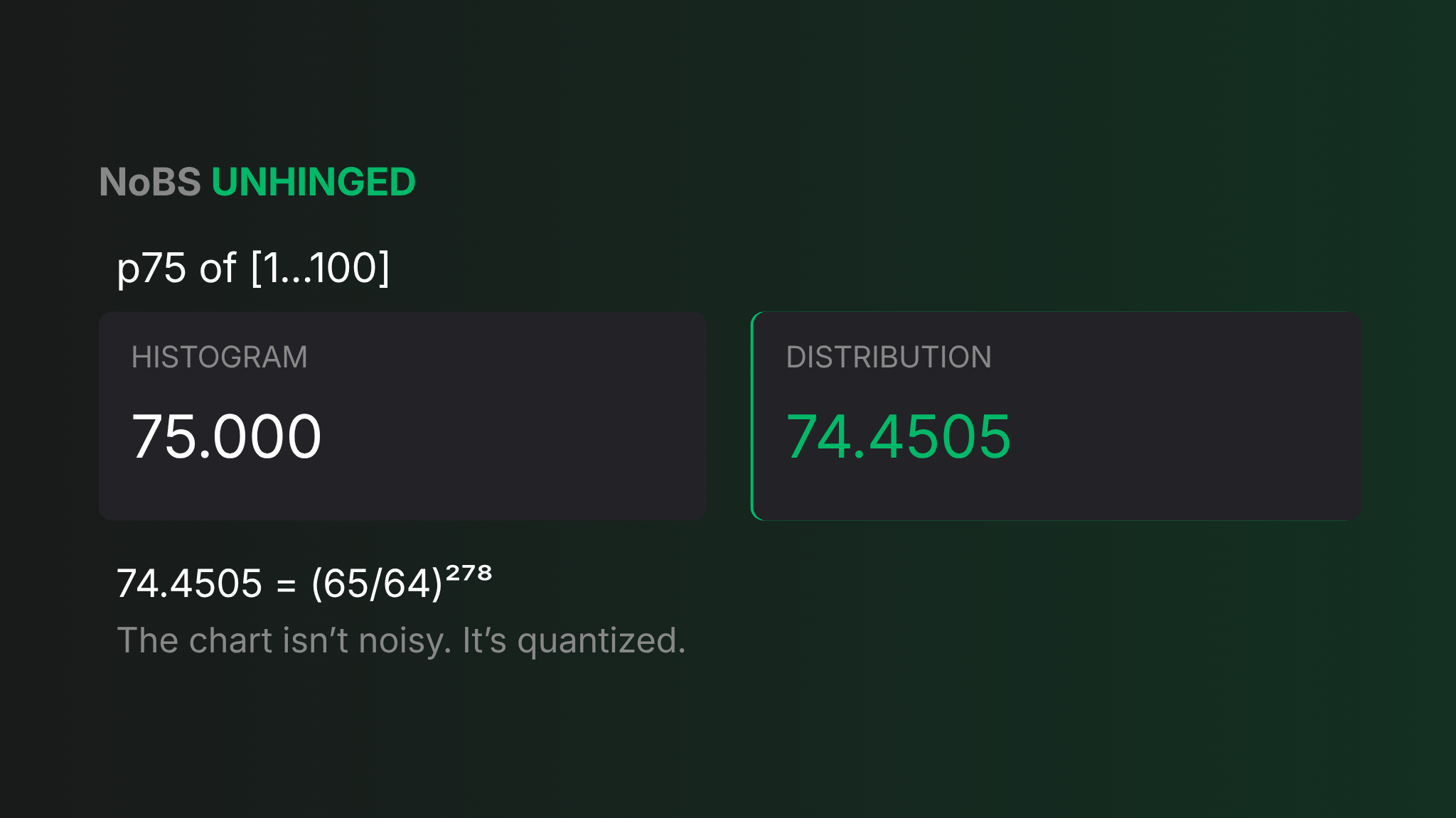
Because the buckets are relatively sized, the accuracy guarantee is relative too - pick a tolerance α, set γ = (1+α)/(1−α), and every percentile the sketch returns is within α of the true value, whether that value is 3 milliseconds or 30 seconds. That distinction matters more than it looks. The older family of sketches guarantees rank error instead - your "p95" is guaranteed to fall somewhere between the true p94 and p96 - and on fat-tailed latency data the values two ranks apart can differ by whole seconds, which is exactly the region you bought a p95 to see. Datadog runs the grid atγ = 65/64 = 1.015625, which works out to α ≈ 0.775%, and I can say that with confidence because the "wrong" numbers confess it: 74.4505 is (65/64)²⁷⁸, 98.4166 is (65/64)²⁹⁶, and all five percentiles I queried landed on exact powers of 65/64. The chart isn't noisy; it's quantized.
What that snap buys is the part histograms structurally cannot have. Two sketches built on the same grid merge by summing their counters - no re-sampling, no compounding error - so the backend can combine hosts, tags, and time windows into a true sketch of the union and answer percentiles over any slice you dream up later. The Agent histogram's exactness, by contrast, dies the moment it leaves the host: once p95 ships as a .95percentile gauge, it is exactly right locally and unfixably wrong globally. And the sketch is absurdly small while doing it - Datadog's own writeup prices full coverage of 1 ms to 1 min of latency at about 275 buckets, roughly 2 kB, and 1 ns to 1 day at 802.
One more detail that makes the whole design legible: my avg came back 50.500 and my max came back 100.000, both exact, every batch. The sketch carries count, sum, min, and max precisely alongside the buckets; only the questions that need the full shape of the distribution get grid answers. So p75 = 74.45 isn't Datadog being careless with my data - Datadog never had my data. I traded the third decimal place for the right to ask percentile questions of arbitrary unions and get answers guaranteed within 0.775%, and once you complicate it that far, it finally makes sense.
Hooray science! We’re trading exact 1:1 accuracy for significant and meaningful flexibility in our data.
No, Don't Convert Everything to Distributions
“Hell yeah Nick, science IS cool! I’m going to go convert all of my histograms to distributions!”, you’re saying now. Hold your horses here, because wait - there’s more. Just because we’re given a ton of flexibility and statistically meaningful data guaranteed across a full fleet DOESN’T mean that using only distributions is the right answer There’s a few things to consider:
-
The non-subtle cost of distribution metrics. A histogram ships a fixed, predictable five timeseries per tag combination (avg, median, max, count, 95percentile) no matter how many samples you feed it. A distribution starts at five (count, sum, min, max, avg) and doubles to ten the moment you enable percentile aggregations, which is exactly why Datadog ships them off by default and makes you go click a toggle per metric. On a metric with real tag cardinality, "just use distributions everywhere" is a line item someone eventually gets asked about. The histogram's cost story is boring, and boring is an argument.
-
Exactness when the scope is genuinely local. The proof: p75 = 75.000 for a histogram against 74.4505 for a distribution. If the question you're asking lives inside one host and one flush interval such as a canary you're watching, a single job runner, a benchmark box, the histogram does real nearest-rank math on the actual samples and the sketch buys you nothing but its error (even if that error is known and predictable). Small N is the histogram's home turf; the sketch's guarantees only start paying rent when there's too much data to hold.
-
Sometimes the per-host answer is the actual question. max:foo.95percentile{*} across the fleet is a legitimate, exact query. "What is my worst host's tail latency". It's a great way to catch the one sick machine that a fleet-wide p95 would happily average into invisibility. A fleet percentile answers "what did a typical request experience"; the per-host percentiles answer "is any host misbehaving," and an on-call engineer often wants the second one. (A distribution can do by {host} at query time too, but each answer is sketch-approximate and you're paying the doubled rate for it.)
-
Operational simplicity. Histogram outputs are plain gauges and rates, so every monitor type, formula, and function treats them as ordinary metrics with zero special cases; no per-metric enablement, no waiting for percentile aggregations to materialize, no "this only applies to data ingested after you flipped the switch". It’s just there and it just works.
When I'd Actually Use Each One
With all that being said - what’s the point of all of this? Do we understand now? I feel like I understand the mechanics of everything at this point in time, but there’s still one thing missing - when do we use these different types?
-
Gauge: What number is something right now? Number of items in a queue, JVM heap in use, CPU utilization, and so on.
-
Count: How many things happened in a window of time? Orders placed, 5xx responses, queries executed, number of site visitors.
-
Monotonic Count: Used for measuring incremental increases; think of it like a trip odometer in your car. You track how far you went one way, reset it, and go somewhere else. Also handy for showing uptime; when it resets to 0, you know you've had a restart of something. Also handy because you can calculate rates and various forms of time/value differences.
-
Rate: Realistically, rates can be more of a pain than they are worth because they rely on you to calculate the rate with API submission, and submitting a count type would be the same data being sent and tossing a rate function on the metric. Personally, I'd avoid using this one because you can get it "for free" with a count.
-
Histogram: For when you have a small number of items where the actual calculated percentile of a small series of data is appropriate, or you need exact values tied to exact hosts or processes. Also good for looking at the "true" maximum or minimum value. Otherwise, this metric type can "lie" unintentionally in aggregate.
-
Distributions: When everything is made up and the points don't matter. The strikethrough is a bit hyperbolic, but it's when you need widespread percentile values across what we can consider "anonymous" data points. That includes looking at p90 latency regardless of which host it's reporting from, serverless resources where "hosts" aren't even a thing, and SLOs where we need to understand the percentage of requests below 800ms. While these values are not "dead-on accurate" due to quantization, they are true percentile representations that do not aggregate improperly over many values.
So there it all is. What I thought was going to be a simple topic that I was going to overcomplicate to understand is actually only simple on the surface. Just like an onion (or a parfait), there are many layers to this; even once you understand the basics, then you get quantization and calculus and all sorts of other fun stuff thrown into the mix. Hilariously enough, I think it was oversimplifying things to begin with! Realistically, do we need to know this stuff at this level of detail? Yes and no. You should absolutely know when to use a count versus a gauge; I’ve seen too many people have incorrect values that lead to real dollars and cents (literally, when calculating revenue) because they used the wrong metric type. Do we need to know that a distribution metric is actually calculated via (65/64)²⁹⁶ (at the simplest level)? Nah. I think we can all agree that a p90 of 59 seconds whether it's actually 58.5 or 59.5 seconds is still kinda shit.
FAQ: Datadog Metric Types Explained
Last updated: August 25, 2026
What are the different Datadog metric types?
Datadog supports six metric types: gauge, count, rate, histogram, distribution, and monotonic count. Gauges capture a single point-in-time measurement, counts tally how many times something happened in a window, and rates show that count divided by a time window. Histograms and distributions both summarize a set of values into statistics like average, median, and percentiles, while monotonic counts track an ever-increasing value, similar to a trip odometer.
On paper they sound simple, but the way each one behaves once real data hits them is where things get interesting.
Why did submitting 10 count values at the same timestamp only produce a count of 1?
API writes at the same timestamp overwrite each other rather than summing, so sending ten separate count submissions all stamped with the same second only leaves the last one standing. You can't send an array of values under one timestamp the way an Agent check accumulates them internally.
In practice, this means any loop or process that needs a cumulative count for a period has to roll that total up into a single data point before submitting it to the API.
Why does a histogram's .count value show up as a fraction instead of a whole number?
A histogram's `.count` submetric is actually submitted as a rate, not a raw count. So if the true count for a flush interval is 15, the `.count` value you see reflects that count divided by the collection interval rather than the number 15 itself.
It's a little unintuitive at first glance, but mostly inconsequential, since you can toggle the display between showing it as a count or a rate.
Why don't a histogram and a distribution return the exact same percentile for similar data?
A histogram is calculated at the Agent, which has all the raw values for that host during its flush interval, so it does real nearest-rank math and hands back an exact answer, but one that's only exactly right for that single host and interval. A distribution works differently: the raw values leave the building and get stored in a mergeable sketch, with percentiles computed once, at query time, across everything reporting to that metric.
That sketch trades a small, bounded amount of precision for the ability to merge hosts, tags, and time windows into one true percentile over any slice you ask for later, which a histogram fundamentally can't do once it leaves the host.
If distributions are more flexible, why would I ever use a histogram?
Cost and exactness are the two big reasons. A histogram ships a fixed five timeseries per tag combination no matter how many samples you send, while a distribution starts at five and doubles to ten once percentile aggregations are enabled, which adds up fast with real tag cardinality.
Histograms also win when the question genuinely lives inside one host and one flush interval, like a canary or a single job runner, since the sketch's error guarantee buys you nothing when the sample size is already small. Per-host visibility and operational simplicity, since histogram output is just ordinary gauges and rates, round out the case for keeping histograms around.
What's a monotonic count metric actually used for?
Think of it like a trip odometer in your car: it tracks incremental increases over time, and you can reset it and start again. It's handy for showing uptime, since a reset back to 0 signals that something restarted, and because you can calculate rates and other time or value differences from it.
Unlike a regular count, the running total persists across submissions rather than starting fresh each interval.
How do I decide between gauge, count, and rate day-to-day?
Use a gauge for "what number is something right now," like items in a queue or CPU utilization. Use a count for "how many things happened in a window of time," like orders placed or 5xx responses. Rate is technically available but often skippable, since you can get the same information "for free" from a count with a rate function applied on top.
Getting this choice wrong isn't just academic; using the wrong metric type for something like revenue tracking can produce numbers that are flat-out incorrect.